Change your colors
Signal paints the entire storefront from seven colours. There are no per-section colour schemes to keep in sync — change a colour once and every section follows.
This takes about five minutes.
Do this
Section titled “Do this”-
Open the theme editor.
Shopify admin → Online Store → Themes → Customize on Signal.
-
Open theme settings.
The gear icon at the bottom of the left sidebar. Choose Colors.
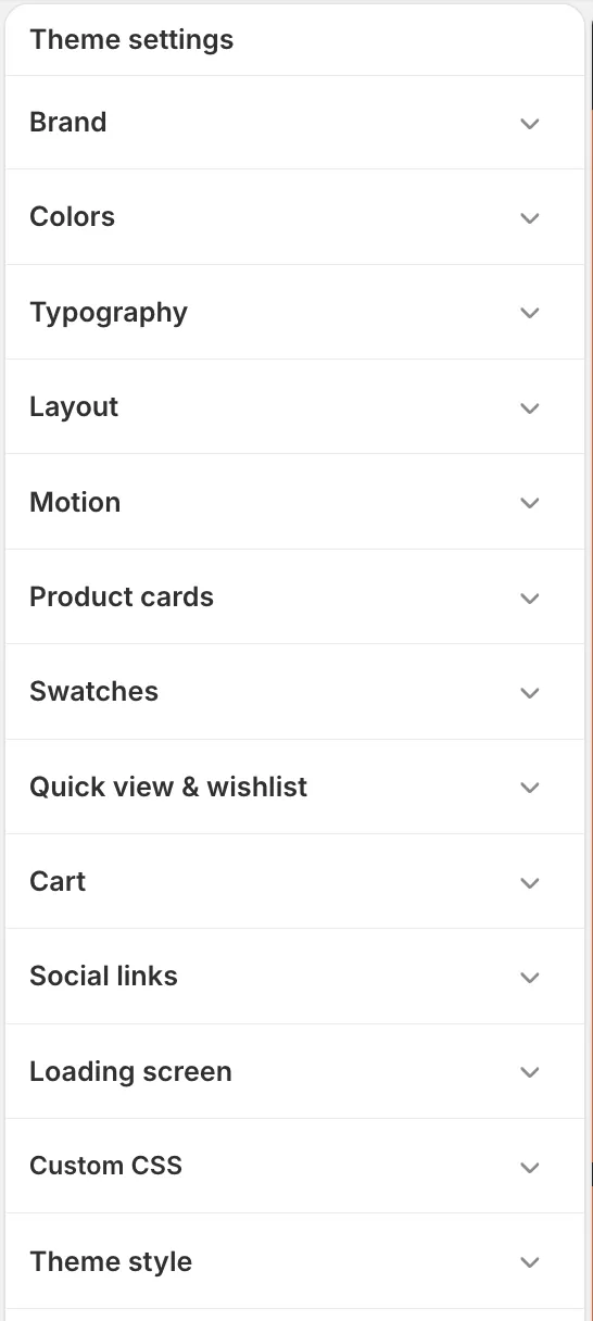
Custom CSS and Theme style at the bottom are Shopify’s own, present in every theme. The eleven above them are Signal’s. -
Start with the two that do the most work.
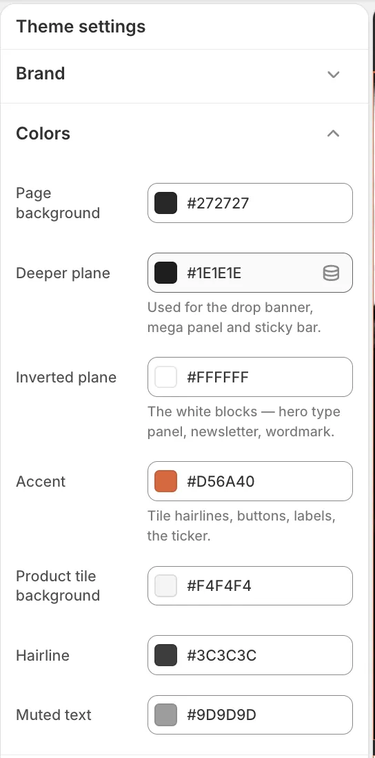
The seven that paint the whole storefront. Page background is your ground — the colour most of the store sits on. Inverted plane is its opposite, used for text on that ground and as the background of the white panels.
Change those two and you have changed the store’s whole character. Preview updates as you type.
-
Set your accent.
One colour, used for buttons, labels, the ticker, focus rings and tile hairlines. It is meant to be the only loud thing on the page — if you want it everywhere, you want a different ground, not a second accent.
-
Leave the remaining four unless something looks wrong.
Deeper plane, Product tile background, Hairline and Muted text are supporting tones. The defaults are tuned to the other three.
-
Save.
What you don’t have to worry about
Section titled “What you don’t have to worry about”Several colours are derived, not set: muted text, accent-as-text, text-on-accent, hairlines on white panels. The theme calculates each one against the background it will actually sit on, adjusting until it clears the WCAG AA contrast threshold.
So you can pick a pale accent without making your buttons unreadable. The theme corrects the text colour on top of it for you.
If it looks wrong
Section titled “If it looks wrong”Everything is too dark or too light. You have probably changed Page background without changing Inverted plane. They are a pair; the second should be roughly the opposite of the first.
Buttons are hard to read. The theme fixes text contrast automatically, so this usually means your accent is close in tone to the ground behind it. Change its lightness, not its hue.
One section ignored the change. It will be an image, not a colour — a background image or a photograph in a section that fills the frame. Check the section’s own settings.
- Typography — the other half of the theme’s character
- Colors reference — what every one of the seven drives, in detail
- Product cards — how colour lands on the product grid