Colors
Signal uses one palette for the whole store. There are no per-section colour schemes to keep in sync — set these seven and every section follows.
Find them in the theme editor under Theme settings → Colors.
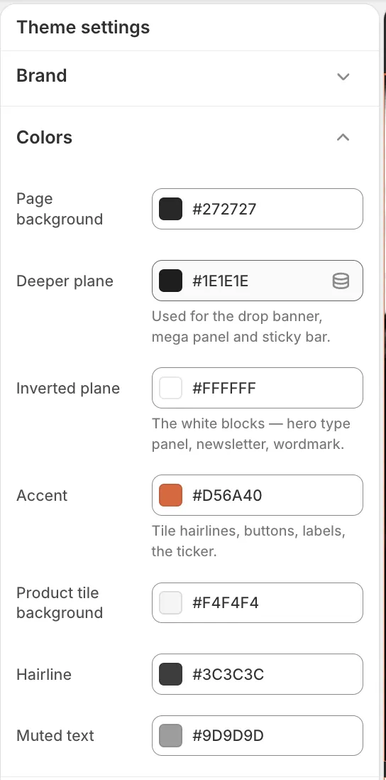
- Page background — the ground the store sits on
- Inverted plane — its opposite, used for white panels and for text on the ground
- Accent — the one loud colour: buttons, labels, the ticker
The seven settings
Section titled “The seven settings”| Setting | What it controls | Default |
|---|---|---|
| Page background | The ground for the whole site. Also the colour of body text where it sits on a white panel. | Near-black |
| Deeper plane | One step darker than the ground, for things that sit on it — the drop banner, the mega menu panel, the sticky bar, drawers. | Darker near-black |
| Inverted plane | The opposite of the ground. Used both as text on the ground and as the background of the white panels — hero type panel, newsletter, wordmark. | White |
| Accent | Buttons, labels and eyebrows, the ticker, focus rings, tile hairlines. The only loud colour on the page. | Burnt orange |
| Product tile background | The plate behind product photography, so cut-outs and transparent images sit on something rather than floating. | Light grey |
| Hairline | Every thin divider on the dark ground — table rows, card edges, drawer borders. | Mid grey |
| Muted text | Secondary copy: vendor lines, unit prices, captions, helper text. | Grey |
Which ones to change
Section titled “Which ones to change”Start with Page background and Inverted plane. They are a pair — the second should be roughly the opposite of the first. Change those two and you have changed the store’s whole character.
Then set your accent. One colour, used everywhere something needs to be noticed. If you find yourself wanting it in more places, you probably want a different ground rather than a second accent.
Leave the other four unless something looks wrong. They are tuned to the first three.
You can’t break the contrast
Section titled “You can’t break the contrast”Several colours are worked out for you rather than set: muted text, accent-as-text, text-on-accent, hairlines on white panels. The theme checks each one against the background it will actually sit on and adjusts it until it is readable.
So a pale accent will not give you unreadable buttons — the text colour on top of it changes to compensate.
If it looks wrong
Section titled “If it looks wrong”Everything is too dark, or too light. You have probably changed Page background without changing Inverted plane. They work as a pair.
Buttons are hard to read. Your accent is likely close in tone to what sits behind it. Change its lightness, not its hue.
One section ignored the change. It is an image, not a colour — a background image or a photograph filling the frame. Check that section’s own settings.
Related
Section titled “Related”- Change your colors — the five-minute version
- Typography
- Product cards